
Dashboard and e-commerce

Smartlife Domotica
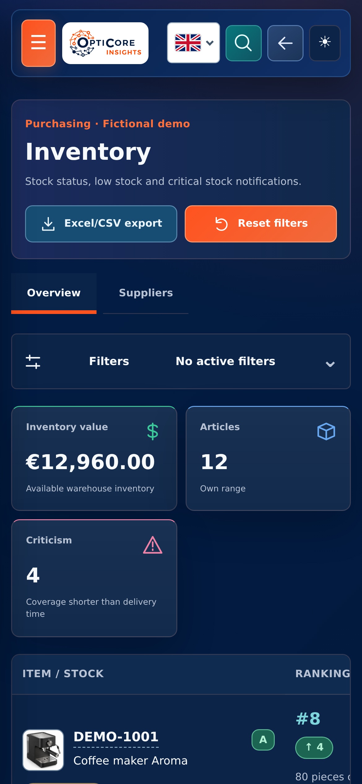
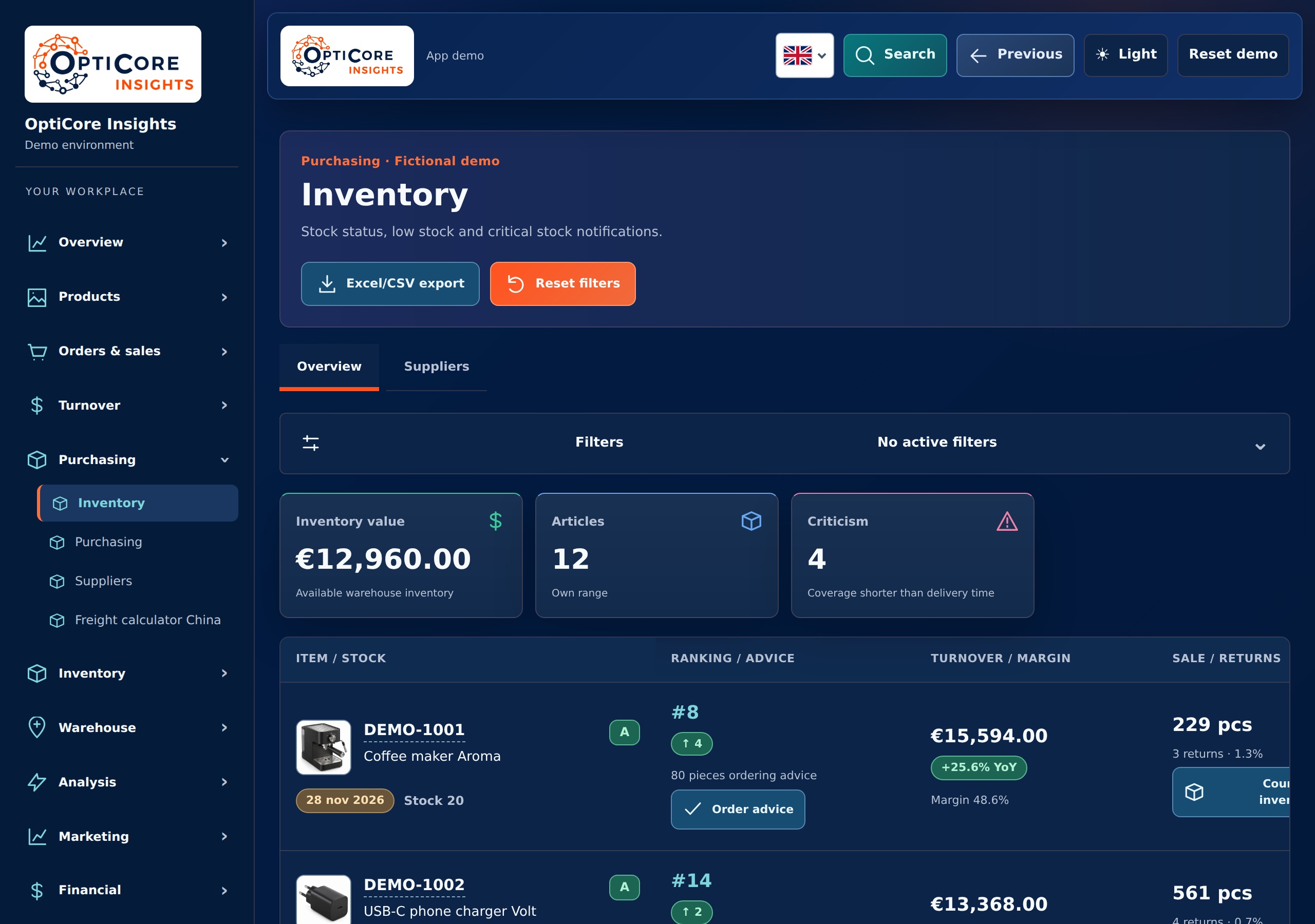
Management dashboard with turnover, margin, inventory and marketing. With links to the sales channels.
View Smartlife Domotica
Power BI brings together data from different sources in reports. You can compare figures per period, department or sales channel.
See the Microsoft example ↗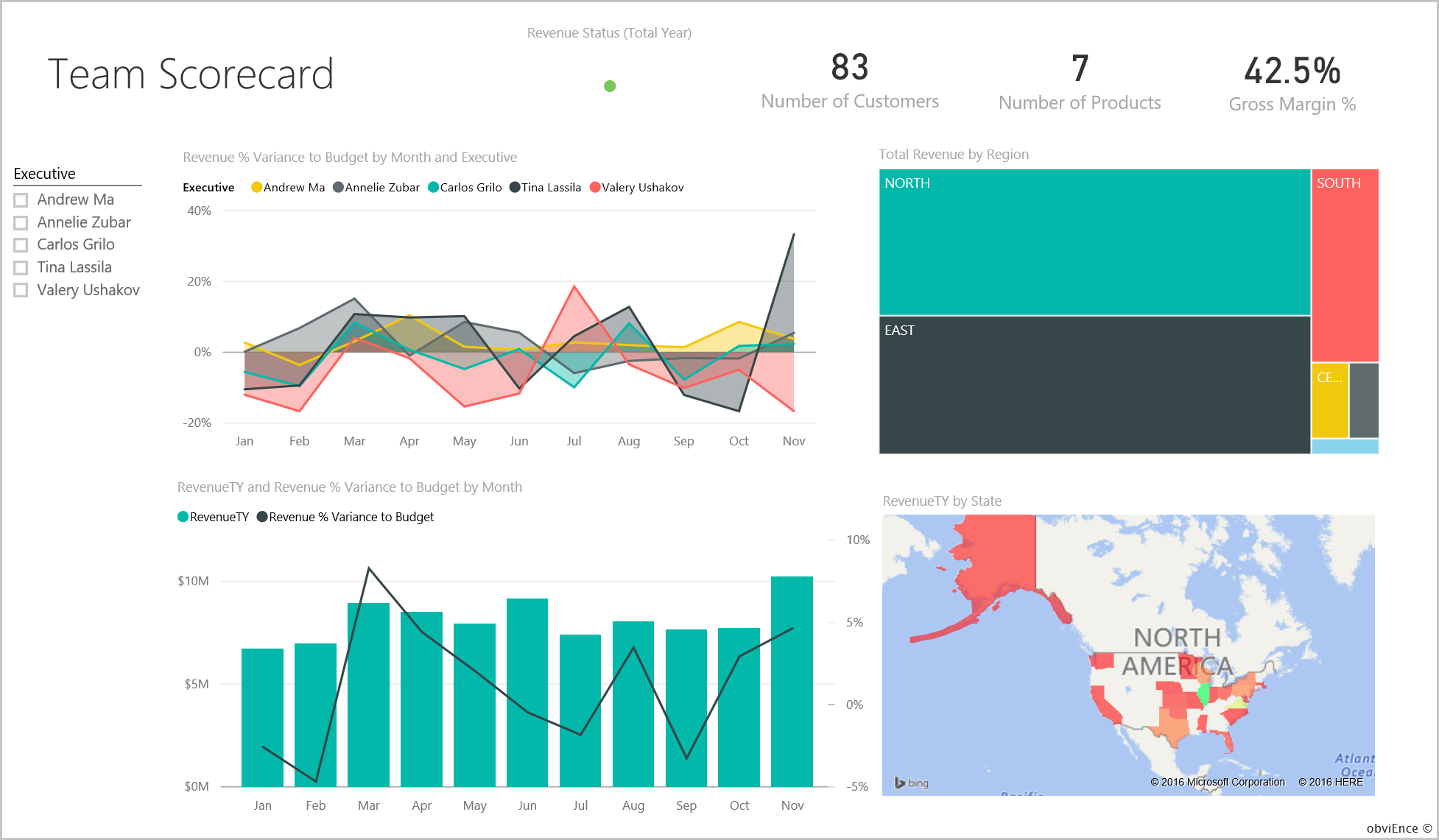
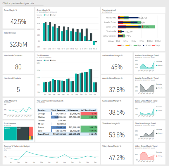
A report starts with agreements about the figures. What counts as turnover, which costs are included in the margin and how often is the information updated? This is followed by the data model, calculations and display.
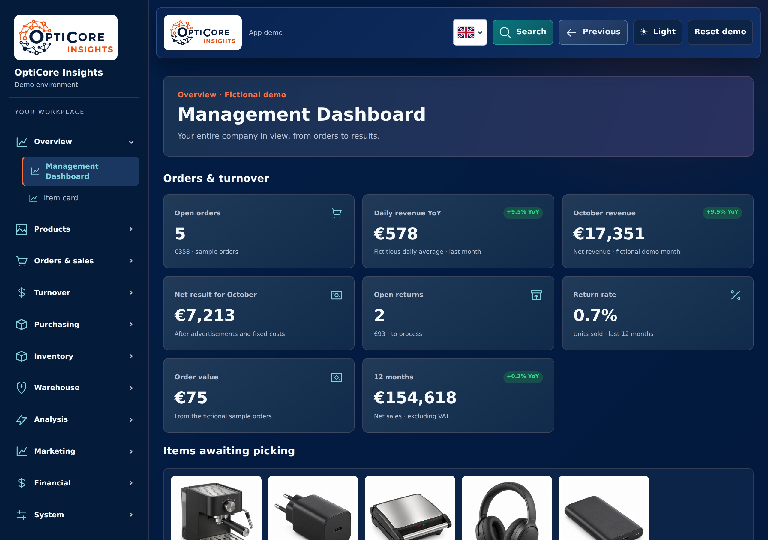
Not every dashboard question asks for Power BI. We built our own web dashboard for Smartlife Domotica, with not only figures but also tools for daily work. View this assignment as an example of that different approach.
Dashboard and e-commerce
Management dashboard with turnover, margin, inventory and marketing. With links to the sales channels.
View Smartlife Domotica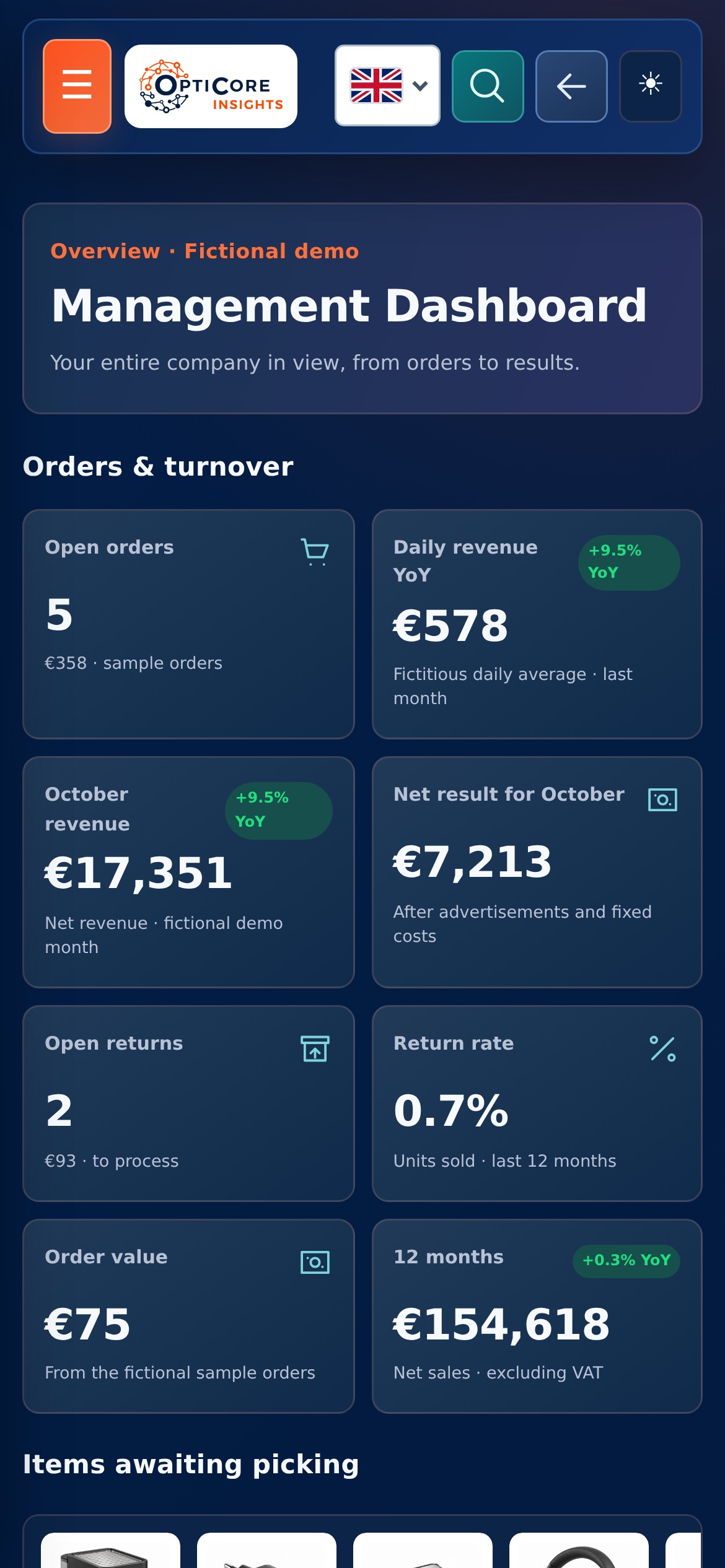
A data model records how data belong together. For example, which order lines belong to an order and which costs are allocated to an item.
A KPI dashboard shows how a company or process is doing. It works best if each number helps answer a specific question.
Reporting and automation require actionable source data. Checks reveal missing, duplicate or anomalous data.
Tell us what you want to have made or what work currently takes a lot of time.
Please contact usPower BI and Excel icons from Microsoft · CC BY 4.0, unchanged. The report images come from it Customer Profitability example from Microsoft and obviEnce. The Smartlife images are neutral examples of functionality, with fictitious data.
Our approach

We make agreements easy to understand and keep you informed about progress, decisions and next steps.

We bring relevant figures together and explain what they mean, helping you decide where action is needed.

We look at which recurring steps could work smarter, with attention to checks, exceptions and the people using them.

We start with a clearly defined step. Then we expand with purpose, based on what your business and workflow need.